Henrik's blog

UnderTale analysis, part 2

January 26th, 2014

A very common feature of especially western games is to try for some kind of photorealism in art style. Where this is deemed inappropriate, such as for games that need to appeal to a wider age group, cartoony graphics are often adopted. However, for games that try to communicate complex themes, cartoony graphics are not common. The choice can be justified by analogy – we wouldn’t choose cartoons over live-action movies to tell our most complex film stories. However, I hope to show that UnderTale benefits greatly from choosing cartoony graphics in telling its story.

Art style and comedy in characterization

To illustrate this point, I want to take some time to compare two games that both fascinated me: Radiant Historia and Phoenix Wright. Radiant Historia in particular got me thinking about this topic because of the somewhat extraordinary portrait art for the main character, Stocke.

Stocke screenshot

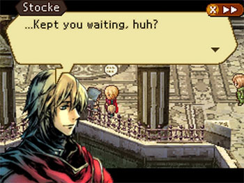
Stocke only has one portrait that is used for every situation in the game. Accordingly, the portrait seems highly ambiguous as to what state of mind Stocke looks to be in. He might be sad, he might be laughing sarcastically, he might be thoughtful or worried. The portrait, in fact, seems to encompass most of the emotions that Stocke displays at all throughout the course of the game.

I was fascinated by this. The question struck me, why not just create a few portraits, each with their own facial expression? This might, of course, be because of technical limitations, but I favour a different explanation. They simply wanted detailed portraits, and when you make detailed portraits, redrawing them from a different angle can lose much of the detail that you’re used to seeing in that character’s art.

Look at how Stocke appears on this cover art for the game, for instance:

boxart

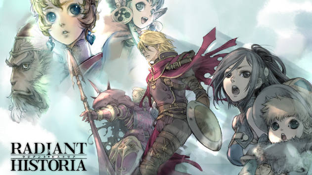
I scarcely recognised him (additionally, I didn’t realize who Raynie was until I thought she was missing). This might not be readily apparent to you if you haven’t played the game, but to me, the Stocke on the cover art has different hair, a stronger chin, different eyes, and a different cloak. For a character like Stocke, who doesn’t have any particular defining facial features (he is a blond man, and that’s mostly it), redrawing him simply serves to make it unclear what he looks like.

The other issue is that if you draw a set of realistic, non-comedic expressions, the effect isn’t necessarily very profound – all you have done is to remove some ambiguity as to what the character is feeling, ambiguity which the player might prefer that you left untouched. So we get less instantly recognizable characters at the expense of effort, ambiguity, and potentially detail. Radiant Historia decided to favour the ambiguity. In exchange, you’re often able to tell a character’s personality instantly from seeing their portrait in Radiant Historia.

Phoenix Wright: When emotions need to be shown

Phoenix Wright is a game where reading other characters’ mindsets is very important. It’s a game where you play as a lawyer, but your role is more that of a detective. Furthermore, since the game is intensely character-focused, your progress is shown through the villains visually breaking down in front of you as you defeat them in the courtroom and show their true colours. It’s extremely important that you are able to make characters that the player loves or hates, and it’s important that you are able to represent ambiguity.

The game is a comedy.

Isn’t that odd? A game with such high goals for characterization and that really wants its characters to be interpretable and well-characterized is a comedy. We wouldn’t see that in, say, Hollywood. If you wanted a courtroom drama, you would do that as a courtroom drama. Doing it in a cartoony style seems unthinkable. You’d want well-rounded, believable characters with realistic, complex motivations.

Phoenix Wright doesn’t eschew complex motivations or well-rounded characters. However, its starting blocks are nearly always highly caricatured, comical designs. Here are some examples.


These characters are, admittedly some of the more comical characters in the game – however, even the more realistic characters have comical or cartoonish mannerisms:


So why does Phoenix Wright work so well? It’s not primarily known for being funny. There are, of course, elements from the game that have entered into popular culture, such as the iconic “Objection!” – but I have yet to meet anyone who thinks of Phoenix Wright as primarily enjoyable for its jokes and laughs.

No, the thing that sets Phoenix Wright apart, at least in my view, is that it uses comedy and caricature to create a diverse roster of fun, enjoyable characters that you can sympathise with because the creators are not afraid of showing the details about them that are over the top, silly, or embarrassing.

But more to the point, the comical, caricatured art style is highly convenient when you want to make expressive animations because you don’t have to hold back when trying to express the character. If you want a character who is obsessed with his own wealth, you can literally have him flash his diamonds with the world’s smuggest smile. If you want the pink magician with the silly hairdo to seem scared and helpless, you can literally have him curl into a half-foetal position with mascara running down his cheeks.

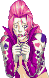
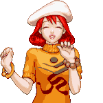
This is the change that comes upon him:


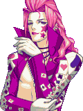
With animations this expressive, we are no longer making “the magician when calm” and “the magician when scared”. We are making animations so expressive that the character himself is defined by how he acts in them. The magician Billy Bob John (as is his name), in our minds, is that guy who breaks down and cries, and who is really cocky on the surface. He also wears mascara, flamboyant clothing, has pink hair, and is a ladies’ man. You can tell most of this from the portrait, and it feeds into the characterization of him in a big way. We only really need to see these two portraits, along with some accompanying dialogue, to feel like we know him – even if we don’t necessarily like him.

Lastly, another advantage of this art style is that the way two different characters express the same emotion will rarely ever be the same. The designers can go out of their way to find a new niche for every new character’s animations, which helps keep every situation and character unique and fresh. If you had to attain realism, then it would be difficult – how many ways can people really smile in, realistically?

This is just another reason why Phoenix Wright benefits so greatly from showing emotions in their characters, and Radiant Historia does not.

Back to UnderTale

This relates to UnderTale in one key way: UnderTale is also not afraid of throwing aside realism in the service of characterization. The first enemy that you meet in the game is a flower with a smile on its face. The design looks like it’s taken out of a childrens’ book. I would claim that it’s impossible not to have this association.

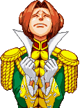
When the flower then tries to kill us, it changes expressions:

The transformation we examined in part one.

These expressions go far, far beyond what you could do in a realistic setting. These quite simply is no way for a human being to do that with its face. Instead, we cannot quite decide if this is just the extent of the flower’s satisfaction at being able to kill us, or if this is simply what the flower truly looks like when it’s not hiding its true appearance.

Either way, it adds greatly to the effectiveness of the scene.

Perhaps more subtle is the way in which the fact that Toriel is not an ordinary human character is useful to the storytelling.

The Toriel we examined in part one.

Toriel is meant to represent a maternal figure who we are supposed to not know whether we can trust, as we established in the previous part of this series. How does her design help with that? I can think of several ways.

  • She has feminine eyelashes and long ears, making her look like a woman with long hair. Her eyes are larger than a normal human being can have, which makes it very apparent when she is happy or concerned.
  • She is large, much larger than you, and makes you look like a toddler by comparison – this can be done without implying that the main character is a toddler, because Toriel could just be larger than humans are. This also makes for effective imagery, especially when she holds you by the hand.

However, the most important detail, as I see it, is this: Toriel is not human. Just like the flower, and unlike the main character, Toriel is one of the monsters of the underground, and it was established early on that these are different from humans. This is extremely important for creating the feeling of distrust towards Toriel. She is in a different group than us, and it’s never even explicitly stated. We simply see her, and know that there is something about her that we cannot trust.

Noise?

As a thought experiment in seeing how important these differences are, try to picture UnderTale happening with people instead of monsters, and with a realistic art style. You meet a person who turns out to want to kill you during the tutorial, and you run into a different person who saves you, and then tells you she’ll take care of you. A good story is still good (and UnderTale’s story is good), but so many advantages fall away.

Not to mention that you get new possible interpretations that add noise to the otherwise elegant and sufficiently complex themes – to recreate the original UnderTale’s divide between humans and monsters, one might be tempted, for instance, to make a racial divide – which would bring a whole host of new connotations.

Of course, in some cases you want the extra “noise” as I call it. After all, it’s just extra complexity. However, in games it’s usually trivial to add more complexity. Our worlds can be infinitely large, we can have infinitely many characters, and our gameplay mechanics in themselves can be extremely bewildering. The difficulty for games’ narratives, in my experience, is to create at least one clean narrative thread that we can follow effortlessly and be deeply engaged in.

I won’t investigate whether I am right in this view – perhaps I will do that some other time. Nonetheless, I hope that this has elucidated some of the strengths of comedy and unrealistic art styles.

1 comment »

UnderTale analysis, part 1

January 12th, 2014

It’s been a while since I last found a project that completely won me over, and I was thrilled to experience that once again with the demo of UnderTale that came out a while back. UnderTale has captivated many, and I think it’s valuable to sit back and analyse why their demo was so good. There is a lot to like, which is why this analysis will be split into several parts, so I can take my time with all of it.

Establishing themes early

Flowey the flower.

After a brief intro, UnderTale starts with an extremely effective scene in which you encounter a friendly-looking flower who tells you he can help you survive in the underworld. He tells you that he’ll give you LV or “Love”, which I took to mean experience pellets. Thus far the mood is friendly and jocular.

However, the “friendliness-pellets”, as the flower called them, turn out to be damage-dealing orbs that take all your life away, and the flower proceeds to try to kill you. When he does, he changes expressions, and his demeanour becomes threatening and insulting. He surrounds us with the death-dealing pellets and tells us to die. The situation seems hopeless.

“In this world it’s kill or be killed!”

The scene is effective for several reasons. Firstly, it’s a normal trope to collect shining pellets for experience. Secondly, it’s normal for games to start off with a brief, friendly tutorial, and Undertale seemed to be going in that direction. It seems to have gone out of its way to make things friendly.

“DIE!”

Then the flower changes not only its expression, but even its art style, turning into something horrible. Even if we expected to be betrayed by the flower (I didn’t), we certainly would not expect a sudden change in art style into something grotesque. It simply does not happen very often in games.

When the flower then turns out to want to kill us, we’re put in a surprising and completely helpless situation completely out of the blue. We haven’t even learned the game’s controls yet, and already we’ve been put in an unwinnable situation. Our trust in the game itself has been betrayed, and we feel vulnerable. We’ve been tricked! Let’s take some time to think about what’s so effective about this moment.

The moment that we are tricked

As soon as we realize that the world in the game was different than how we had predicted it to be, several things happen.

  1. We get off our high horse and admit that we were caught off guard. We take the narrative more seriously.
  2. We internally try to figure out what we did wrong that caused us to get tricked.
  3. We revise our expectations of the world so that we won’t fall for the same thing again.
  4. There is a moment where the game can capitalise on our brief confusion and introduce a highly effective dramatic event. (In this case, the flower tries to kill us immediately once we realize we were tricked.)

This is the most important moment in the demo’s intro, and for the player it passes by in a flash. As the flower taunts us and tries to kill us, the fact that it effortlessly surrounds us with the same pellets that robbed us of 49 HP and brought us down to 1 HP makes us feel completely helpless. The sequence is well choreographed and timed with loud sounds effects, changes in facial expressions and music, and is therefore highly immersive compared to what comes before and after. We are briefly given control of the hero again, just to show us that there is no escaping the flower’s attack.

This all helps to make the sequence dramatic – which is a goal in itself, but also serves to strengthen the lesson we learned in points #1, #2 and #3. And the lesson we take away from our encounter with the flower monster is that we cannot trust this world, and we cannot assume that we know anything. We are now highly motivated not to be fooled in this way the next time around.

UnderTale is aware of the fact that it has hooked us in this way, and builds on this theme of distrust.

Toriel – Escalating the themes

This is where a lot of games would try to elaborate on its themes through dialogue. Perhaps someone says something to the effect of “I don’t know how I can trust anyone anymore.”, and is forced to defend this position to some character who disagrees. Perhaps we see characters who have different takes on the subject of trust. This is not uncommon either. We’ve all seen villains who represent the negative response to some established fear. For instance, a villain who, unable to trust anyone, decides to kill all monsters, or kill all people.

UnderTale doesn’t do this, and instead does something that turns out to be (more?) interesting. Instead of presenting a solution to the problem of trust, it elaborates on the theme by presenting a more complicated relationship based on trust. That is, it hooks us on the thought of “I will not be tricked!” and then it presents a situation in which that thought can be very problematic. This is done through the introduction of Toriel.

The maternal figure Toriel

Toriel is the mother-like creature that saves us from the flower-monster. She has long eyelashes, a friendly face, a soft voice, she is calm, polite, thoughtful, helpful, and friendly. Of course, we don’t trust her one iota.

We are led through the remaining tutorials by Toriel. The game gives us plenty of opportunities to live up to her trust or betray her trust, and no matter what we do, she treats us kindly. However, her kindness is shown to have a negative side – she doesn’t want us to fight, preferring that we talk our way out of combat situations, and she takes away our opportunities at gaining experience from enemies, scaring them away from us before we have defeated them. She also prevents us from tackling the game’s first puzzle, saying that the puzzle was still a bit too dangerous for us.

Finally, there is a sequence where she seems to have betrayed us, but it turns out she simply left us alone for a while to test our independence. She apologizes profusely, and says she has to be off to do something else. However, as we play through the game itself, she keeps in touch by phone.

In short, we are given plenty of reasons to both like and dislike Toriel’s parent-like doting on us, and this complicates the issue of trust. However, the game doesn’t stop there. Enemy combat keeps defying our expectations, as you can talk to enemies rather than defeat them. Sometimes, the best way to progress is to not fight, but rather to comfort an enemy, or cheer for them. You are led to wonder whether or not the “enemies” of enemy encounters deserve our trust. Often they do.

Breaking conventions for a reason

It’s tempting to look at Undertale and praise it primarily for the originality of its mechanics and its light-hearted style. However, I think the most crucial aspect of the game is that it uses both its style and its mechanics keep the emphasis on the theme of trust. All the puzzles and all the enemies act in surprising ways, and we cannot even trust the game’s mechanics to be unambiguous. Playing the game is an exercise in avoiding trickery – which all builds up our fear of Toriel, and what she might really be like.

This is the last crucial point that I would point out this time about UnderTale: It doesn’t break conventions simply because it can – it breaks them because breaking conventions makes us think differently. It shows that breaking convention is not something to be done for originality’s sake – it’s just another tool that can be employed to strengthen themes and guide the player’s thinking.

If there is one general game design lesson to take away from UnderTale’s excellently crafted narrative, it’s how it creates cognitive dissonance in this way. When something defies our expectations, it makes us think. Why? Because if something defies our expectations, it means we were wrong, which means there is something to think about. If you are able to predict what the confused player will be thinking, then you can, like UnderTale, tell a story where a lot of things go unsaid, by following up the thoughts that you predicted with more food for thought.

Seeing games do this well can give us insights into how best to do this – like in the case of UnderTale, which unexpectedly changes art styles and pacing to great effect, as we saw before, and which shapes the game’s mechanics around the themes it wants to communicate.

Next time I’ll look at how UnderTale’s art style, and how it simplifies effective characterization.

2 comments »

Why 2D, Why Pixels?

April 13th, 2013

Before I get into the specific games I want to analyse, I want to discuss a topic that I think is very important, and which I’ll keep referring to when I analyse games on this blog.

You may have noticed that Owlboy is a 2D game that uses pixel art. We often say in interviews that we think that there is more to be explored in the 2D medium, and that that’s the reason why we chose the style we’re currently using. But what do we mean by that? Surely there is also much to be explored in 3D, too? Why, then, do we continue with 2D?

The answer is of course that we see a lot of unused potential in 2D, and specifically in low resolution. Most 2D games are created in as high a resolution as possible these days, and we wanted to go in the opposite direction. Here’s some justification for why one might choose that direction.

The advantages of specifying less

Have you ever seen a film where you hated the ending, or where the ending ruined the sense of mystery that the film had for you? Have you ever read a book, and then upon seeing a film version you felt that the character didn’t work at all for you anymore?

Congratulations! You have been the victim of specificity!

Many pieces of fiction work well because the telling of the story has specifically excluded details that would have jeopardised the our enjoyment of the narrative. We don’t want an action tale where we follow the hero to the bathroom, or a love story where lots of time is spent describing a particularly unattractive feature of one of the love birds’ appearance. Ideally in a piece of fiction, we are shown the thematically relevant details and details that build up the atmosphere that we are trying to establish.

Seems obvious enough! How does this relate to Owlboy?

In games, the opposite is currently the status quo. Worlds are made as rich and expansive as possible, and the graphics as detailed as possible. It’s natural, in a sense, because games don’t suffer from being too long, nor does a highly detailed character model have to be distracting in the same way that a long, boring, descriptive paragraph would be in a book. However, the more realistic detail you show your world in, the more you are replacing abstractions with specific details.

This is a design choice. The best choice is not always to specify more; sometimes it is better to specify less. Let’s do some basic exploration of that notion.

Introducing abstraction to games

So we now know that we will often want to reduce complexity by abstracting away parts of our games. How does one go about doing that? Let’s take a concrete example.

Let’s say you have a character who you want to be mysterious, and need to convey this through how the character is shown in the game. How do we solve this issue? Well, we could simply not show the character’s face or facial expressions. Not so hard! Now we are provided with a sense of distance to the character. Very mysterious!

But what if we want the character’s face and emotions to be visible? Suddenly the situation is difficult. We could try to underscore some sense of mystery in the specifics of what the character says, or in the character’s voice – but this is suddenly very fragile. It relies on good writing, and a good voice actor. And what about localised versions of the game? The dubbing and translation would have to be spot on for the effect to carry over. We could give the character a facial expression that hints at whatever mystery we have concocted – but what if we want to show other emotions too?

Let’s see what Final Fantasy 3 did in this situation.

Final Fantasy 3

In the 2D medium with low resolution graphics, the solution becomes much simpler. By default, the camera cannot be moved. This means that the character’s face is small, and subtle emotions cannot be conveyed in cutscenes. This means that the emotions we do show (through the music, or through a limited number of expressive animations) carry more weight. Added to that, your brain fills in the facial expressions for the characters in various scenes – meaning that the blank face in the screenshot has become an abstraction for any range of facial expressions, emotions and attitudes that you can project onto Terra.

Whether you approve of pixel art or not, it is clear that the design problem of characterizing someone like Terra is suddenly much easier. The low resolution gives us an art style that cannot show the subtleties that we don’t want to give away or specify. We can hide away the parts that we want to remain hidden, and show the parts that should be in focus. Terra’s emotional crisis is clear, yet what and who she is remains a mystery, despite her being in plain view. To show what happens when we remove this abstraction from Final Fantasy 3, here is concept art of Terra in Final Fantasy Dissidia.

Terra in DissidiaNow, this isn’t how I pictured Terra by a long shot – in fact, I doubt that I would enjoy Final Fantasy 3′s opening sequence if this were the character I was following, regardless of how much I love that scene in its current form. Subjective opinions aside, with a character this detailed, it’s difficult to create the mysterious character that we described. The character’s emphasis is shifted as we remove the abstractions of pixel graphics.

I should clarify that I don’t think pixel graphics or increased abstraction are a silver bullet, or that pixel Terra is objectively better than Dissidia-Terra. However, the principle seems to often be overlooked in gaming: increased abstraction and ambiguity can help tremendously with telling a story.

The principle, of course, also applies to gameplay. When you don’t have to show the player’s every action in great detail, you’re a lot more free as to how you implement various mechanics. Many games these days, like Assassin’s Creed, feature fighting systems where you basically press a button at the right time to make your character kill an enemy in a spectacular, gory cutscene. The reason is that the fighting has to look like real fighting – yet there is no way to make intuitive controls for the finishing moves that the assassins pull off. In this way, the graphical realism leads to less physical gameplay with lower player involvement.

Finally, some things to consider

Thanks for staying with me so far! That was a brief introduction to some of my reasons for liking pixel-based games. Before I close out the post, here is some more food for thought:

  1. What does this mean for making games child/family-friendly? Could more abstract art styles make it possible to make a game that both children and adults can find enjoyable? Is this harder to achieve with more detailed, high-definition games?
  2. How many of the advantages and disadvantages of 2D over 3D stem from some kind of innate difference between the formats, and how much stems from the way that we do 3D currently?
  3. One final clarification: I’ve been equating pixel art with reduced detail for a while now. This is somewhat misleading. Pixel art can be incredibly detailed – but it is one abstraction further away from realism, hence it presents the world with less realism. Pixel art can be extraordinarily realistic and detailed – however, the point of this post was to show that it can lend itself nicely to introducing helpful abstractions as well.

Fun stuff to think about. I’ll be writing more stuff like this (though hopefully shorter) in the weeks to come, whenever I find some spare time.

See you then!

4 comments »

Hello, blog!

April 11th, 2013

Hi, welcome to our personal blogs, where we’ll be blogging a bit to share some of our experiences with game making. I’m Henrik, and me and Jo are the programmers at D-Pad. We also do much of the design work on Owlboy, of course, and so I’ll mostly be writing about game design, rather than programming topics.

I think that as indies, we have an opportunity to regard games slightly differently from how others do, and we can set ourselves different kinds of design goals and analyse games differently. So these blog points will hopefully shed some light on how I and others at D-Pad look at various popular games.

I have already planned out analyses of a few games, which I’ll probably get to in not too long:

Bioshock (the first one)
I want to examine the storytelling technique that is employed, as the game was widely lauded for its story. I aim to show some of its weaknesses.
Dragon Age: Origins
Why the characterization in this game didn’t work for me, despite immense amounts of time and effort put into it.
Starcraft 1 and 2
On how better technology can force (at times unwanted) design changes.
Chrono Trigger
On why Chrono Trigger and the SNES were a perfect match and made the game timeless.

As a quick disclaimer, I would point out that I’m very much a fan of old NES/SNES-era games, and I hope that with these posts I’ll be able to show some of the reasons why.

See you soon!

Comment »